Pulled & Pressed
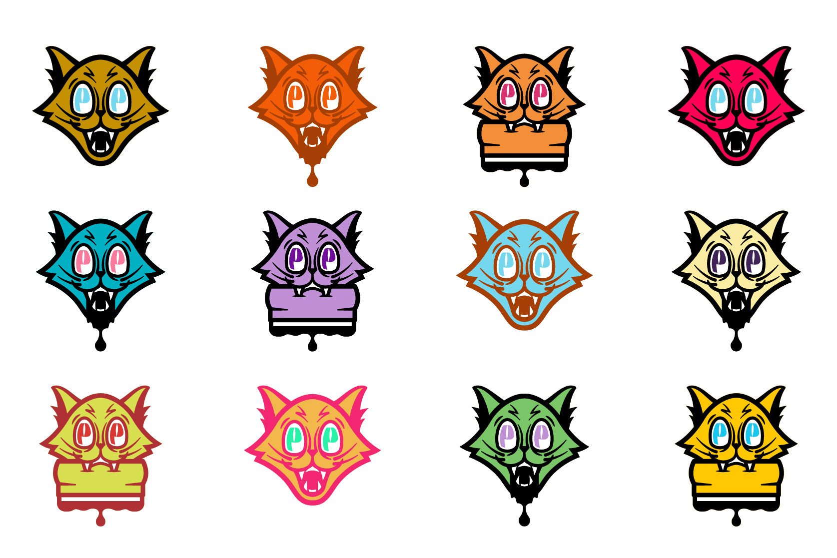
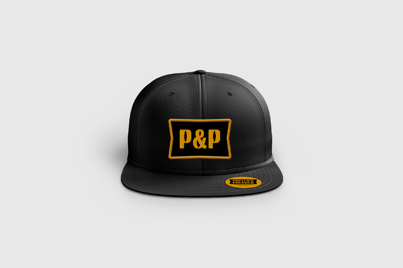
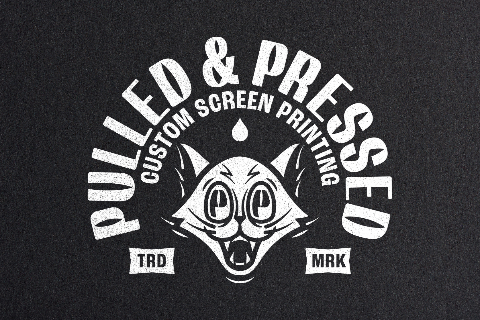
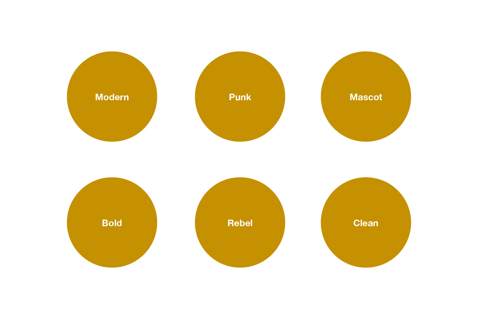
Pulled & Pressed is a boutique screen printing studio located in Northeast Indiana. Starting out of a home garage, the owner was looking to scale up his studio and brand identity. After a few conversations and brainstorming, the client and I decided on a few words to help drive the design including: Modern, Punk, Mascot, Bold, Rebel, Clean. The initial focus was to work on the mascot element that would ultimately become the logo mark. There were several concepts sketched and presented to the client, who ultimately landed on the cat head for the primary graphic. After approval of the primary logo mark, the design was expanded into a full logo lockup including custom typography, alternative formats, and multiple cat head variations. The color palette was developed with inspiration from vintage art of the 50's and 70's along with 80's and 90's skateboard culture. The final designs were tested and applied to mockups including embroidery, screen printing (of course) stickers, and a business card to ensure both the regular and inverted version of the logo was working on multiple background colors and applications.
Services:
Logo Design, Brand Identity, Illustration
Concept Sketches


Custom Typography